Tuesday, March 26, 2013

NOT JUST ABOUT THE SNOW

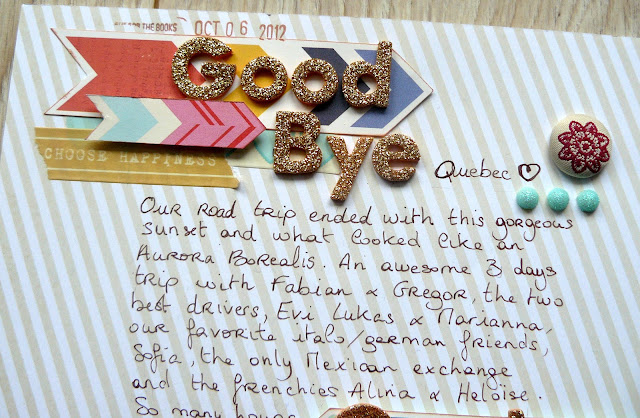
I don't know about you, but i'm a big Glitter Girl fan! And i was super inspired by one of her recent project. Maybe because it was all about using your favorite supplies (yay to alphas). Or maybe because it had a square design. Anyway, here's the layout I ended up with. And seriously love.
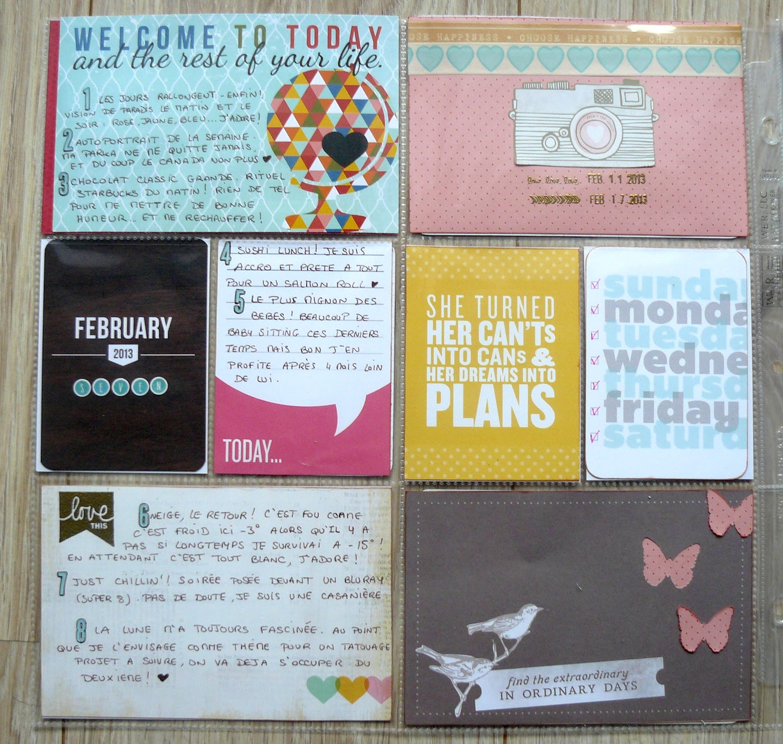
I recently bought a 6x6 paper pad. My very first one. I'm not a huge fan yet. But since the design of this layout called for 4 6x6 squares, that was kind of perfect. I took 4 I really liked and would match the photos (there were some lovely blues in the pack but that would have been way too much so close to the very blue pictures. But I still wanted some more blue somewhere. And then I saw this gorgeous paper from the new Amy Tan collection. Perfect. At this point there wasn't much more to do. Added my title, playing with some new and not so new thickers and alpha stickers. Oh and because i'm still not over the arrow trend, i added a few here and there.

A quick word about papers and waste. I usually don't show it on the photos (because it's not super pretty), but i hate wasting pretty papers. So when i know only a very tiny part of my background paper will actually be visible (like this blue one), i just cut the middle, so i can use it on another project. But because it tends to make the layout a lot more fragile, i'll add a white cardstock as a base. I do this super often, mostly because i very rarely buy two sheet of the same paper, and want to use it as much as i can. Do you do the same thing? No one really talks about it.

Friday, March 22, 2013

GOODBYE QUEBEC

Lately, I have been trying to integrate more journaling onto my layouts. I know my pictures usually tell the story because by just looking at them i start to remember little details and what actually happened when i took the shot. So that's why i havn't felt the need to journal much before (that and my handwriting). But what's gonna happen in a few years, when i'll look at the pictures and won't remember all the little details? ... Hence me trying to journal more.
I was inspired by this sketch over on Shay's blog to make this actual layout. And since i had just received the new Dear Lizzy collection, including that gorgeous arrow paper, i decided i'd use them as accent so my journaling wouldn't be lost on the page. The background paper is also from a Dear Lizzy collection (the 5th & Frolic i think) Since that would be the main paper, i wanted something with a patter, but i had to be able to write clearly on it. This one ended up like the best choice. 
I wanted my title to be on two different spots even though Goodbye Quebec is actually the first sentence of the journaling. So what i did is start with the thickers, then move on with the handwriting and made sure i repeated the word Quebec in the text, somewhere near the second arrow, and used the thickers again. So in fact you can read the title by just looking at the thickers but each word is also part of the journaling. I kinda liked that idea :)

Funny detail: i realised once i was done that everything had ended up a bit too much to the left of the layout, leaving way much more space on the right that i had planned, and that was weird. So i just took the two rolls of washi tape i had used on the layout (just got them, love them. from Glitz!) and added some on the right side, with a bit of twine. I doesn't take your eyes off the main part of the layout too much, but i do think it brings a bit more balance.
Wednesday, March 20, 2013

LADY LIBERTY

Remember that layout about Staten Island? Well that new layout is gonna be next to it in the album. It's not a double page layout (i'm really not a big fan of those) but i still wanted them to look a bit alike, so i used that same Pink Paper and also those hot pink thickers. But that's pretty much it.

Here's a quick step by step of how this layout came together:
My starting point. simpler would be difficult
More papers, a picture and some doodles. don't ask me why, i have no idea. just felt like it.
add your title and the base for your embellishments: washi to ground everything and wood veneer because i love them

Keep on embellishing. And finally some journaling and the date. and a couple phrase stamps.


This layout was really fun to create. I love how the simplicity of the sketch is balanced by a lot of embellishing with tiny bits and pieces: papers, stickers, dots, veneers...
Note: the sketch was inspired by this layout from These Boots were meant for blogging. I love her style!
Monday, March 18, 2013

PROJECT LIFE WEEK 7

Week 7, aka the week i decided to go with squares. 

Trying to change things up a bit from week to week, mainly so i won't get bored with it. I mean, who would want to use the same design on a 12*12 traditional layout again and again? Well, i feel the same about PL! And because i'm a big Instagram addict, i could not resist this square design and bought a dozen sleeves. 
I filled them with random pictures of my week, trying to recreate a typical day, from morning off to work till night. But i still had this left page to fill (since the other side had week 6 on it) so i decided i would put all my journaling and pretty cards there. Here's how it looks:

Just bought a heat gun (yes, 100 years after everyone else) I tried to resist for as long as i could, but maybe i shouldn't have, because i love it! And obviously my first choice went for gold!! <3


For the right pocket, i simply added all of my pictures (printed with my new Selphy). This little printer has changed my life my scrapbooking! Also added some washi and a number to each. Number that matches the one on the journaling cards from the left spread. Super simple. 
Thursday, March 14, 2013

BLOG READERS: BLOGLOVIN'

Hi!! 

Google Reader is no more, that's now official. And a lot of you look really bummed about it and have been asking about other blog readers to use so i though i'd do this quick post about Bloglovin'!

Personally, i have never used Google Reader, so this is not a comparison. Just me telling you why i love Bloglovin' so much :)
First reason: the design is super clean and easy. A year or so ago i was looking for a blog reader to help me get organized with my reading. I did not like Google Reader, mostly because, well it wasn't really pretty, or clear. Then i discovered Bloglovin'. It was super easy so i started adding blogs to it, and now i'm using it daily, both on my computer and iPhone (yep, they have an app, free of course!)


When i say it's easy, it really is! On the main page you can see the blogs you are following and their latest posts. If you click on one of them, you'll be redirected to the blog, well the post in fact, which is way better. But you're still on Bloglovin, which means you can jump to another post of your feed anytime, no need to go back to the BlogLovin' main page! You can also comment the posts without issue this way, which is super cool!


Here's another snapshot of the main page. Once you’ve created an account you can search for and follow your favorite blogs, organize them in group however you like and also claim your own blog, so people can follow you too!
Hoping this has been helpful to some of you, and a couple links to finish:
How to claim your blog on Bloglovin’ (first link).
- How to import your Google Reader into Bloglovin' (so you don't have to start from scratch!): http://www.pricelessadventure.com/2012/04/how-i-set-up-blog-lovin.html
Also, if you ever wanted to, you can follow me here - post your link below and I’ll follow back if I don’t already!
Wednesday, March 13, 2013

STATEN ISLAND

Back to New York with a new layout. I've been using white cardstock a bit more lately. I'm more of a patterned paper type of girl usually but i've been wanting to use ones with such bold colors that white background are a must to bring a bit more balance. 
This one started with this large piece of multicolor paper (from October Afternoon i think). I then went to my scrap basket to find pieces in matching color. Ended up with one teal, one yellow and one pink. Perfect match to the large piece of paper. I have a ton of pictures of the statue of liberty and the New York skyline in basically every color: B&W, natural, pinkish... I eventually went with the B&W version, and added a piece of hot pink to mat the photos so they would stand out more.
Then i just added my title, playing with my alphas. And created a few clusters of embellishment. Nothing fancy, A couple gems, these gorgeous resin flowers (that are actually from my SC PL kit), this gorgeous flair (also from my PL kit) and a couple stickers. Simple simple, that's the way i like it! 
Make sure to come back tomorrow, i will share another layout, that i made the same day to go with this one. There might be a little step by step process ;)

Monday, March 11, 2013

PROJECT LIFE WEEK 6


Week 6, aka the week i took so much pictures on Sunday that i had to add a second page.

I'm running a bit late with this project, considering i did this spread yesterday (at least the left side, i in fact did the right side 2 weeks ago). But that gave me the opportunity to play with the new Dear Lizzy and Amy Tan collection. Way too gorgeous, i'm in love with every single piece <3.
And this is the right side, all about a 3 hour date night with my favorite friends. Yes i did a whole spread just for that, but that's what i love with Project Life, you can do anything you feel like.So that everything would mix well i edited all the pictures with the exact same actions on Photoshop and sticked to a very simple color combo: white, grey and red/pink. Most of the supplies here are from my February PL kit from Studio Calico. I just added a couple stamps here and there. Came together super quickly, which is always nice :)
Friday, March 8, 2013

WE'D ROCK AS A BAND

I love Dear Lizzy, that is no secret. And though i had no trouble using most of the papers and embellishments, when it came to this gorgeous multicolored chevron paper, i became a serious hoarder. But then i ordered the new Lucky Charm collection, and thought i had waited long enough. I took it, and just cut it in three pieces. The worst part was over. Time to have some fun . I picked a picture, every alpha i was currently in love with a bit and pieces from my embellishment bowls. 


I was inspired by Melissa Stinson (aka the Scrappy Jedi) to use vellum to frame my photos. It looks pretty cute and creates a nice border between my bold paper and just as bold photo.Also used some more glitter tape (and jsut received silver glitter tape, the love isn't over), and the flair is from my for ever favorite flair maker shop A Flair for Buttons. And that's pretty much it. Thanks for looking!
Wednesday, March 6, 2013

NEW YORK


One of my trip during those last months took me to New York. If you're a European like me, and have spent a bit too much time watching TV series growing up, then you have dreamt of New York, the Central Perk with Monica, Rachel and Chandler, Broadway with the cast of Glee, the Met with Serena &  Blair...

That's the story i wanted to tell with this layout. Yet there isn't many words, or much at all on the layout. I'm ok with that, the title says it all. And that picture, well that's New York to me.

Monday, March 4, 2013

PROJECT LIFE WEEK 5


Aka the week i went crazy with the gold.

It all started with this gorgeous gold glitter tape. Then i couldn't find a nice card to put underneath the "make something today" vellum so i thought i'd just paint a blank card in gold. Then i painted another card, and the edges of two others. Added gold thickers to my titles. And there it was, the gold week!
Used a few items from my February PL kit, including two gorgeous 4*6 cards. The one with the triangles is one of my all time favorite, wish i had more of it!

Added a few stamps here and there, some writing, including this lovely quote from John Green which was perfect for this week. And that was it!