Tuesday, February 26, 2013

OUR FAVORITE BRUNCH

New layout! Keyword: colors! 
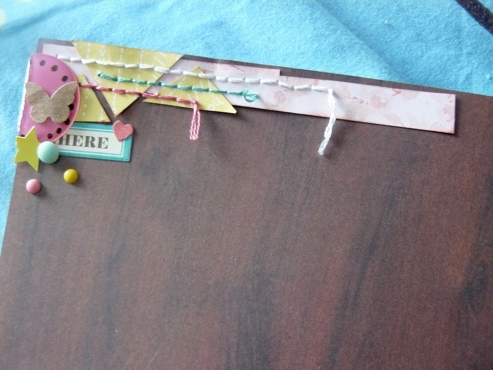
A few layers of pretty colorful papers, chosen at random or almost. There are 3 different colors yes but also 3 different patterns because i don't think repetition is good on the eye (yes, there is such a thing as too much polka dots if you want my opinion.). Beside the fact that i wanted different patterns, i also try to be careful about the base color of the paper, that is if they are white based or cream based. All of these, including the background are cream based which helps bring them all together. The only white elements are the 3 tags (from my PL kit, the same as you saw yesterday on my PL spread). It seemed like a nice way to bring the eyes to the embellishment clusters.
Another thing you might have noticed on my layouts is that i never mix brown and black but always choose between the two. In this case i knew i wanted to use those woodgrain thickers by Amy Tan (gorgeous right?), so everything was inked in brown, and the journaling was written with brown ink. On this layout for instance, because the background wad grey, i did everything else with a black pen. Do you do the same thing on your layouts?
Monday, February 25, 2013

PROJECT LIFE WEEK 4


Another week, another spread. Loving this project.

It was a pretty quiet week, except for the fact that it finally snowed in Paris. Definitely had to include that. Then a few random everyday pictures: breakfast at work and lots of cozy night spend reading under a blanket. Aka, perfect winter nights.

I printed a bunch of Elise Blaha quote cards a while ago and decided to include this one. A very simple week, a very simple quote. It doesn't take much more sometimes.

Had some fun with this awesome woodgrain washi and some stitches. The pink paper is from 5th & frolic.
I wanted to do something a little different for this picture of my street covered in snow so i printed a 6x6 square that would take up 3 slots. Used a lovely 4x6 card from 5th & frolic to put underneath, and some glitter thickers. love those way too much.


The January PL kit from SC included a bunch of brown etiquettes, and i had only used a couple of them so far so i covered a 3x4 cards with them to journal about the photos around since the other cards were pretty busy already.
And that was it. I really like the soft colors of this spread, and the big picture. Need to do that again!

Friday, February 22, 2013

REDESIGNING

Hi!

Just popping in to say that things might start looking weird on the blog this weekend. I've been feeling like changing things up a bit here so i'm working on a new design <3

Everything should be brand new and pretty by Monday!

Wishing you a lovely end of the week!

Wednesday, February 20, 2013

RIDEAU FALLS

New layout, based on a design Shimelle uses quite often and that i love very much. i wasn't very sure at first if i wanted the black paper on the right and the blue on the bottom, or the other way around, so i just cut my papers both way to see how it looked like. I don't have issue with cutting such pretty paper because with simple shape like rectangles i know i can use it an any other layout. And i find it much simpler to use pretty papers once the first cut has been made! In this case i ended up thinking the darker paper would look nicer at the bottom since the pictures were already a bit dark.

I'm not a big fan of cardstock so i went looking for another piece of patterned paper for the background and found this green striped one from an the first Amy Tangerine collection (i think). I have like 5 pieces of green paper in my stash and i always have the hardest time using them, i guess green isn't my color. But in this case the green was a PERFECT match to the blue paper and i love the very thin stripes.
The black camera paper is from the Darling Dear collection by Studio Calico and there is a very similar paper in the collection, black as well, with speech bubbles on it. I decided to cut a few of those and spread them on my layout to balance a bit the black on the layout.


Then i grabbed my die cut bowl to create this little cluster on the layout. the orange one us actually a 4x3 card from my SC PL kit. It had a nice saying at the top "For the record" next to which i stamped a few things but kinda messed up so i ended up covering it with a piece of the blue paper on the background. i think it looks pretty nice so no big deal after all.
for the title i had this old green thickers that i never use (again, green issue) but were a perfect fit to the background and the not too girly style of the font matched the square design of the layout! 

Aaand i was done. Simple simple. 
Monday, February 18, 2013

PROJECT LIFE WEEK 3

Another week, another spread.
Still loving this project.
One page for one week. Biggest news was startinh a new job so i used the top pockets to talk about that. Middle pockets are about the weekend i spent babysitting my nephew (ins't he the cutest?). One 4x6 to tell the story of my smoothie adventure (and play with my stamps). And i moved the week card to the bottom corner for a change, leaving it pretty empty because i loved that star paper.

I used cards from my Project life kit, including the one of the top left corner with the bubble speach.  really wanted to use this one but it said "hello 2013" in the middle so i ended up covering the bubble with vellum, filling it with confetti then stitching to close it. I think it's pretty cute. The other 4x6 cards are patterned paper from various brands. A few embellishment here and there. Keeping it simple.
Wednesday, February 13, 2013

GRAND CENTRAL TERMINAL

Starting point - Episode 2.
When cutting that hot pink piece, i knew i would use it to frame my photo with the title underneath. That worked out pretty well. i don't use grey, or cardstock, very often, so it was the perfect time to use one of the black & white pictures i had (out of 300, i'd say less than 15 are B&W). Only a couple were made for a single photo layout and were horizontal, so picking was pretty easy.

I should maybe mention that i never take pictures directly in black & white, i add it after, using my Radlab actions to find the perfect shade of B&W (yes, there is a lot of different B&W). But that's an entirely different subject (and post?).
Funny story about the title. For those of you who have been to New York or just know this place, you might call it Grand Central Station, or Grand Central Terminal. Apparently, both names are ok, but i just felt like a 3 word title didn't work, because it took things too much to the right. And since it was already pretty busy on the right with the embellishment clusters from the center and the bottom, i decided to go with grand central.
Talking of embellishments, i created the cluster using some tags (from Sleigh Ride, even though this layout is neither about xmas or winter), some bits and pieces using the color scheme of the floral paper, a flair, some enamel dots and a few stamps (i'm really liking it more and more, especially little stamps put together)
Added some journaling about how this place mainly reminds me of Gossip Girl (yep, i watched Gossip Girl), added a nice XOXO stamp just perfect for the occasion and that was it.
Monday, February 11, 2013

PROJECT LIFE WEEK 1&2

Hello! Starting off a new week and going back a little to share my Project Life spread for Week 1&2.

Keeping things simple, mainly by not doing a full 2 pages if i do not want to. During the first 2 weeks of January, i mainly stayed home, readjusting to France and getting ready to start a new job, so there wasn't that much things to journal about. Hence the 1 page spread.

Shared about my favorite holiday activity: going to the movies; about January the 1st, aka the day i do absolutely nothing but sleep and recover from the day before party; and seeing a couple of my friends after 4 months abroad.

Only used my PL kit for this spread, plus some washi, alphas, stamps and bits and pieces. Sounds like a lot, but it really wasn't. For the journaling, i decided to write in upper cases everywhere. Makes it very clear and easy to read, and I'm not a big fan of my handwriting so it's a nice compromise. 

See you next week for Week 3!
Friday, February 8, 2013

ON THE FERRY

First layout made with my February starting points. When i create my starting points, i usually don't have a picture in mind, so i just go with papers i really want to use (like this dark woodgrain) or a color combo i really like (pink, yellow and teal, what's not to love). So when i actually start to scrap these layouts, i first have to find a picture that will match. I'm not too worried about finding the perfect one since i currently have hundreds waiting to be scrapped. Instead of looking at them one by one, i tend to use the photo index i get when i order them, and quickly look at all of the little vignettes. 
In this case, 5 photos (over 300, that's pretty good narrowing right?) looked like they might work. I grabbed those 5 and put them next to the layout. 3 didn't work that great and 2 were perfect. The reason i picked this one? The very simple and central design of the starting point made it great for a "transition" layout (layout where i introduce a new place in the album, in this case our arrival at Tadoussac). This process took me about 10 minutes.
Time to scrap then! I wanted a bit more yellow on the layout, and really like the idea of arrow to make the design even more "central". I first tried with triangle wood veneers, yellow paint... and finally decided to cut them out of the same yellow paper i used for the border. Added some stitches (while watching The Middle, i'm a multitasker ;)). I had little yellow triangles from my first attempt, so i decided to use them on top of the layout. Added some more stitches, and a few bits and pieces.


I had the title in mind for a while, but could not find the perfect pink alpha for the title. Ended up discovering this purple one at the bottom of my stash (it's a very old Basic Grey alpha), then wrote the rest of the title with my wood veneer alpha (told you i'm obsessed.
And i decided to stop there. Lots of white space (not so white in this case) can be good sometimes.
Tuesday, February 5, 2013

PROJECT LIFE - JANUARY


I know it's already February. And I'm way behind. But who cares? I've been having SO much fun with Project Life this last week, and I'm now ready to share it here.

I'm using Design A by American Crafts. I haven't bought any Becky Higgins products because as a European i would have to buy from their England warehouse which is wayyy too expensive for me. Hoping they'll become available somewhere else soon, i just love the Seafoam and the Midnight kit too much.
Instead, i've subscribed to Studio Calico Project Life kit, which i loove, and i'll be also using my own supplies. The album i'm using is from American Crafts, a blue chevron from a Dear Lizzy collection. It's gorgeous.

I decided to make a one page spread to introduce January/the new year. Not sure if i will do that every month, i guess we'll see.

I used lots of washi, wood veneers (i'm IN LOVE with the tiny wood veneer alphabet, get ready to see it everywhere on my projects!), bits & pieces from the everyday eclectic collection and this "Hello There" tag is from Ready Set Go by Amy Tan. That's pretty much it, and my version of keeping it simple!I'll be back soon with Week 1&2!
Monday, February 4, 2013

FEBRUARY STARTING POINTS

When i started to scrapbook again, the first steps were the hardest for me. Picking up papers that matched together (and with my photos) and assembling them to create a nice "background" to create on. It usually took me hours and by the time i had done it, i wasn't even in the mood to start embellishing, adding the title... Then i started following Shimelle's blog and discovered the AWESOMENESS of starting points. They made creating easy and fun again.
I don't use them all the time but they make a great base and are perfect is you don't have too much time during the week days but want to have some quick fun scrapbooking from 10pm to 11pm. During the weekend, i'll take all my current fave papers and my stash of scraps and i'll create a few starting points, ready to be scrapped during the week. Works great for me and my schedule. 

Above are the three starting points i made for February. I'll be back soon to share the layouts i'll make with them. Feel free to use them! I'd love to see how similar/different our layouts would be!