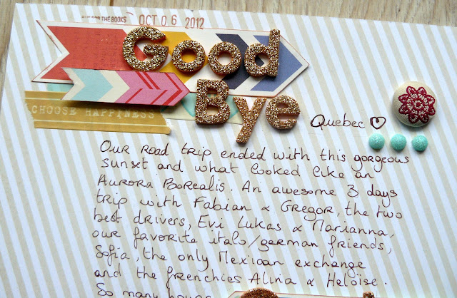
 Lately, I have been trying to integrate more journaling onto my layouts. I know my pictures usually tell the story because by just looking at them i start to remember little details and what actually happened when i took the shot. So that's why i havn't felt the need to journal much before (that and my handwriting). But what's gonna happen in a few years, when i'll look at the pictures and won't remember all the little details? ... Hence me trying to journal more.
I was inspired by this sketch over on Shay's blog to make this actual layout. And since i had just received the new Dear Lizzy collection, including that gorgeous arrow paper, i decided i'd use them as accent so my journaling wouldn't be lost on the page. The background paper is also from a Dear Lizzy collection (the 5th & Frolic i think) Since that would be the main paper, i wanted something with a patter, but i had to be able to write clearly on it. This one ended up like the best choice.

I wanted my title to be on two different spots even though Goodbye Quebec is actually the first sentence of the journaling. So what i did is start with the thickers, then move on with the handwriting and made sure i repeated the word Quebec in the text, somewhere near the second arrow, and used the thickers again. So in fact you can read the title by just looking at the thickers but each word is also part of the journaling. I kinda liked that idea :)

Funny detail: i realised once i was done that everything had ended up a bit too much to the left of the layout, leaving way much more space on the right that i had planned, and that was weird. So i just took the two rolls of washi tape i had used on the layout (just got them, love them. from Glitz!) and added some on the right side, with a bit of twine. I doesn't take your eyes off the main part of the layout too much, but i do think it brings a bit more balance.
Lovely layout...the journaling looks awesome!
ReplyDeleteLovley! Love your arrow shapes and love those DL gold letters! Terrific job.
ReplyDeleteGetting all the words onto the page is something I struggle with - and this design works so well for that. I love it!
ReplyDeleteAwesome layout love how you incorporated the journaling
ReplyDeleteLove the gold letters! Just stunning with the stripes, turquoise hearts tape! Love all the details !
ReplyDelete