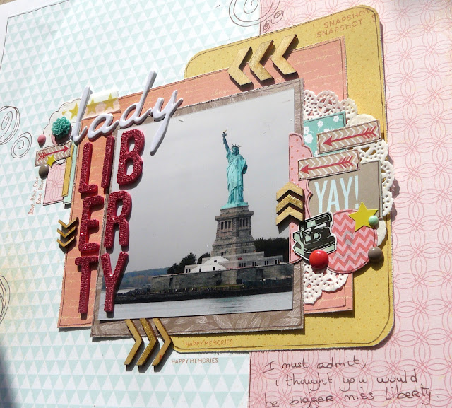
Remember that layout about Staten Island? Well that new layout is gonna be next to it in the album. It's not a double page layout (i'm really not a big fan of those) but i still wanted them to look a bit alike, so i used that same Pink Paper and also those hot pink thickers. But that's pretty much it.
Here's a quick step by step of how this layout came together:
 |
My starting point. simpler would be difficult
|
 |
More papers, a picture and some doodles. don't ask me why, i have no idea. just felt like it.
|
 |
add your title and the base for your embellishments: washi to ground everything and wood veneer because i love them
|
 |
Note: the sketch was inspired by this layout from These Boots were meant for blogging. I love her style!


So nice to see this beautiful page come together, Alinor!
ReplyDeleteLove the doodles and the arrows going around your photo, it looks great! x
ReplyDeletegreat layout
ReplyDeleteGreat step-by-step. Love the doodles and all those layers
ReplyDeleteBeautiful! I love the doodles you've added. I wish I had the guts to doodle directly on a layout! I really like the look.
ReplyDeleteLove this layout! Really beautiful.
ReplyDeleteThe doodles turn out nicely. I like seeing your process, as well. And Lady Liberty....well, she speaks for herself! Great photo of her! :)
ReplyDeleteYou did a marvelous job with all the bits and pieces! Thank you for showing the process step by step.
ReplyDeleteThankyou for showing your process! Love the doodles, such a unique touch! Love the cluster of embellies! Thanks for sharing!
ReplyDeleteGreat page, love the doodles :)
ReplyDeleteI really enjoy seeing the process when people make scrapbook pages. Gorgeous page!
ReplyDelete