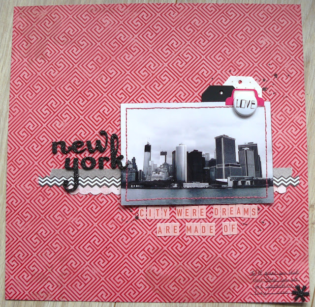
One of my trip during those last months took me to New York. If you're a European like me, and have spent a bit too much time watching TV series growing up, then you have dreamt of New York, the Central Perk with Monica, Rachel and Chandler, Broadway with the cast of Glee, the Met with Serena & Blair...
That's the story i wanted to tell with this layout. Yet there isn't many words, or much at all on the layout. I'm ok with that, the title says it all. And that picture, well that's New York to me.


This is gorgeous! Love the b&w photo on the red background!
ReplyDeleteI love that the background is so bold! It really works on this layout:)
ReplyDeleteNice layout! I love the black and white photo against the bright background.
ReplyDeleteThe photo is gorgeous and so striking with the background!
ReplyDeleteLove the photo and the bold background, gorgeous :)
ReplyDeleteLove the simplicity of it!! It's beautiful.
ReplyDeleteLove the color scheme you chose for the black and white photo! Great layout! :)
ReplyDeleteI love this, the BW photos works great (but just because I would want to know, I think you mean "where" not "were")
ReplyDeleteOh shit. Thanks Laura!!
Delete:)
Delete