Thursday, August 30, 2012

SEA, ROCKS & SUN

Second attempt at scrapbooking large pictures. It's pretty cool. Especially the -everything comes together so quickly- part. I'm in love with that background paper, clearly still not over chevrons! Also had some fun with some of my current favorite alphas: teal glitter, woodgrain and white. we have a winner!
Just added a bit of paper layering for my journaling (it's in french, sorry guys!) and then a few embellishments (mostly circles since everything else is so rectangular!) 
I also thought it might be fun to join in a challenge, so i chose SJ Craft Summer themed challenge. You can join here too ;)

Here are some detailed shots:
 Thanks so much for taking a look!
Tuesday, August 28, 2012

ACROSS THE OCEAN


As you're reading this, i'm on a flight taking me from Paris, France to Ottawa, Canada, where I will be living and studying for the next 4 months!
I've traveled a bit, but never outside of Europe. Yet I've just embarked on a 6000 kilometers flight across the Atlantic ocean on to a new Continent. I'm pretty excited! To say the least.

I've got a lot of traveling planned, all around Canada first (every major cities, the Niagara Falls and i would kill to see Lake Moraine, hope i will make it), and then probably on to the East coast of the USA: Boston, New York, Washington... I'm living the dream & will most definitely enjoy every second of it. I know many of you are from Canada & the USA, so any suggestions are more than welcome!

Blog related, i'm not quite sure what will be happening here. I'm not taking much craft materials with me (i already have more shoes and clothes that the 23kg limit lets me take so there really is no room for patterned paper) but i've created a 4x6 mini album that's going with me and will serve as a journal to record my everyday. So I'm guessing there won't be much layout sharing here (except for a few i made lately but haven't showed you yet), but many travel photos and thought along my journey. 
So if you wanna tag along, get in & join me in this incredible journey!
Friday, August 24, 2012

SUMMER BOOK PAGES PART II


It's been a while since i told you about my Summer mini book. The thing is, i had some kind of a change of heart about the design of the album. One thing i learned: i am not much of a messy, free style scrapbooker. i love patterned paper, clean layouts with pretty embellishments. So i redesigned the mini albums pages entirely, and i love the look of it!


Each prompt got two pages, not side by side but back to back. Not very logical, but i liked it that way, feels more like a real book. Every page as a A side made of patterned paper and a B side made of one of the book page. They're all stitched all around (which took foreeeever to do, since i don't own a sewing machine!), and with a cute doily on a side (i got the idea from Carrie lovely mini). The papers are all different and from various collections: some old sassafras (i'm still hoarding some pieces ^^), american crafts, echo park, studio calico... but look quite awesome all together! 
I'll share the next pages here soon and tell you more about the embellishments i used!
Wednesday, August 22, 2012

VAMOS A LA PLAYA

I don't know about you, but i think summer wouldn't be summer without at least a few days at the beach. I don't like hot weather that much, or sand stuck in every part of my body, but there's just something about the smell of salty water & the sound of crashing waves that makes me feel good. 
Scrapbooking related, it means one thing: i have hundreds of pictures of blue water, waves and sandy toes. Expect a lot more layouts.

There's probably no need to mention it, but yep, this is another layout made with The Perfect Collection.
Monday, August 20, 2012

THE STORY BEHIND

The place: Barcelona
The event: my sister bachelorette party

Everything was ready for a memorable night. We had planned cocktails & tapas, dinner and a night club by the sea. But when do things ever go according to plan? Not this night anyway. But even though with didn't go to the restaurant, or to the night club and ate some not so good tapas, well we had lots of cocktails and laughed for the whole night. Because all it really takes is good friends!


And one more layout from Shimelle's The perfect collection class. 4 more to go!

Have a great week,
Thursday, August 16, 2012

CREATIVITY


As you know, i've been taking Kara's Summer love class this summer and one of the prompt was: What is your summer word? Several came to my mind right away, but most of them could have been my 'word' any other month of the year. 
It's been 4 months since i opened the blog, 4 beautiful summer months of creating, scrapbooking, sewing, blogging, and so it came to me that the right word was creativity. Since September is coming, i thought a little review of what i've been doing here would do me good. I've tried a few different features, some have stayed, some have not, and some i'm not quite sure yet.

I could decide on my own, but since there isn't much point in being a writer if you have no reader, i'd love to have your opinion I've put on a little poll and I’d love for you to click and let me know what you think. (it should take 10 seconds, and you can choose up to 3 answers!)
Wednesday, August 15, 2012

SUMMER PARADISE

I recently got a new printer and been dying since to try and print some big photos to scrapbook. Well call that done. I printed my favorite photo from the week i spent in Portugal on an A4 sheet. Considering how large was the picture, the rest of the layout came together pretty quickly.


I used this gorgeous piece of paper from Studio Calico, and somehow the sentence at the bottom felt just right with the photo. Then just bit and pieces of embellishments, some glittery thickers and it's done.

Tiny detail no one really care about. Summer paradise is actually the name of a song from Simple Plan i really like.

Tuesday, August 14, 2012

STORAGE SOLUTION

Someone yesterday asked me how i stored my flairs, so i thought i'd just show it to you.


That's the front of my desk, where i keep all the supplies i use more often, like pens, scissors & washi. My trimmer is on the left and on the right are my adhesives. 

It's really easy to buy new types of embellishments, put them in a drawer and never use them. That's why i went for little bowls, super easy to go through and cute!
The green bowl is where i keep a mix of embellishments like die cutes from my current projects.

Have a great day, I'll be back later today with a layout!
Xo, Alinor
Monday, August 13, 2012

PRODUCT CRUSH: A FLAIR FOR BUTTONS

Hello, it's time again for a new edition of Product crush Monday.

We've been seeing a lot of flair (or badges) around lately in the scrap world, both from big scrap companies and small Etsy shop owners. I'd like to talk to you about one of them today, which products i love!

The shop is called A flair for buttons and it's filled with lovely themed flairs. There's lot of sets to choose from but you can even make your own set by picking out your favorite flairs from any existing set. I've ordered a few of them recently and been having lots of fun with them on my layout (including Palm Trees, the latest layout i published). Shelley, the shop owner is the sweetest and so easy to get in touch with if you have any question (it's one of the things i love most about Etsy!).

Here's a few of my favorite sets (i bought the first one ;)):


flair in action, from the flair random images set

So, what do you think about the flair trend? In or out?
Xo, Alinor
Saturday, August 11, 2012

PALM TREES

Hello :)

I still have a few layouts from my Barcelona trip to share here but i thought it'd be nice to change a little bit, and let's be honest, i was dying to use some cute papers i bought last month!
The pictures is from my latest trip to Portugal, taken with my iphone and edited with camera + and iPhoto (i used the same technique as the one share yesterday to erase a bin that was in the middle of the picture (you can see the original picture here). I had some fun with a few trending elements: hexagons, flairs, mist and as always, butterflies!

Some detailed shots:

Those cute flairs are from A flair for buttons, which i'll tell you more about on Monday

Have a lovely day, Alinor
Friday, August 10, 2012

IMPROVING YOUR PHOTOS WITH IPHOTO


Did you ever took a picture that felt perfect except for that one little detail that ruined it all? What if you could just erase that detail? Well you can, and it's how so simple!

I'm a Mac user, so i'm using iPhoto with this tutorial, but I'm sure some PC software propose the same thing (Photoshop does!!)

I took this sunset shot while on a train ride and ended up with a picture i really liked except for all those cables. Here's how i created a cable-free photo.
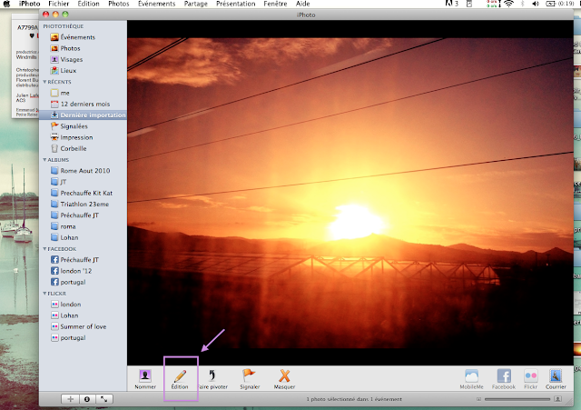
Open your photo on iPhoto and click on the edit button.
Choose the 'retouch' option


Choose the element you want to erase. In my case, the cables. Click once or click and drag to cover the element you want to erase. Note that you can adjust the width so you erase only what you want.
Release the mouse. The cable has disappeared, replaced by what should be underneath. Magical, right?
Keep on until you've erased everything you don't want to see on your photo.


And here's my final shot, 5 minutes later!

The simpler your background is, the easiest it is. But pretty much everything is possible if you give it some time. 
Here's another example, a bit more complicated since the background is busier. This time i used Photoshop CS4 which has similar tools, like the patch tool or the pattern stamp tool. I had this picture i quite like but the girl in the back really was on the way sooo i kinda erased her :)

Here's the before & after shot:

Simple, right? I'll be back tomorrow with a layout i did using this technique for my photo.
Until then, have fun editing!
Thursday, August 9, 2012

A WONDERFUL THOUGHT


Spending my days watching the Olympics. That's weird how much i'm into it considering how much i don't like sport the rest of the time! While doing so my hands feel pretty bored though, so i started a little sewing project to keep them busy.
I spotted this cute embroidery pattern a while ago and decided to use it but with a different sentence.


I had no fabric on hand so i went with aida cloth instead. It's definitely not perfect since it shows a little through when exposed to direct sunlight, but since i'm keeping it far from direct light it's just fine on my wall!
I liked the original sentence but i had another one on my mind at the time, so what i did is write the sentence down on photoshop, pick a pretty font and then printed it at the right scale. I then used it to copy the text on the cloth with a light pencil and began stitching.

Here's how it looks:

Tuesday, August 7, 2012

PARC GUELL


Today i'm sharing with you my first ever double page, made with Shimelle's class The Perfect collection and the Sketchbook line by Amy Tangerine. I had lots of fun doing these pages, i clearly aded less details than i would on a single page layout but i think it works better this way.