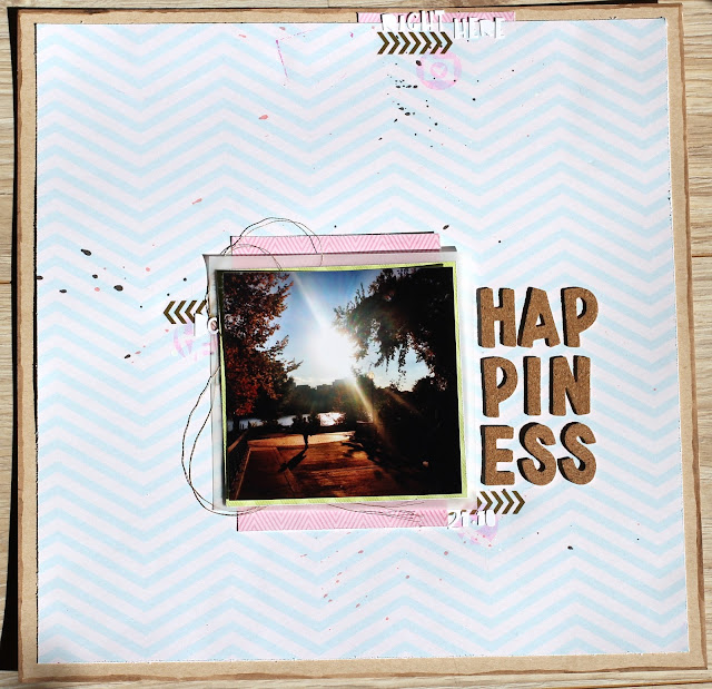
This photo reminds me of a lot of things. Mostly lots of emotional things. Which is why i went with a very clean and simple design. not much words, just the ones that matter. Sometimes, i feel like words are simply not enough. So i rather let the photo do the talking.
Pretty much all the supllies are from my July Studio Calico Kits, except for the pink and green papers that are from my scrap basket. I love alphas, but i'm pretty sure i could survive with just these two. Cork and white. Simple, right? Also, i need a LOT more of this light kraft paper! That's the new white Bazzil people.


I adore this layout, and the pic is amazing!
ReplyDeleteI love the photo! The twine behind is such a good accent and the vellum is perfect! Thanks for sharing!
ReplyDeleteNice layout, the twine adds a nice dimension and loved how you stacked the title.
ReplyDeleteLovely photo and the white space really puts the focus on it. I love how your title, broken up into rows, balances the photo, too.
ReplyDeleteBeautiful love the simplicity of the design :)
ReplyDeleteClean and simple, but just the right mix of mixed media. Wonderful creativity.
ReplyDelete