
First layout made with my February starting points. When i create my starting points, i usually don't have a picture in mind, so i just go with papers i really want to use (like this dark woodgrain) or a color combo i really like (pink, yellow and teal, what's not to love). So when i actually start to scrap these layouts, i first have to find a picture that will match. I'm not too worried about finding the perfect one since i currently have hundreds waiting to be scrapped. Instead of looking at them one by one, i tend to use the photo index i get when i order them, and quickly look at all of the little vignettes.
In this case, 5 photos (over 300, that's pretty good narrowing right?) looked like they might work. I grabbed those 5 and put them next to the layout. 3 didn't work that great and 2 were perfect. The reason i picked this one? The very simple and central design of the starting point made it great for a "transition" layout (layout where i introduce a new place in the album, in this case our arrival at Tadoussac). This process took me about 10 minutes.
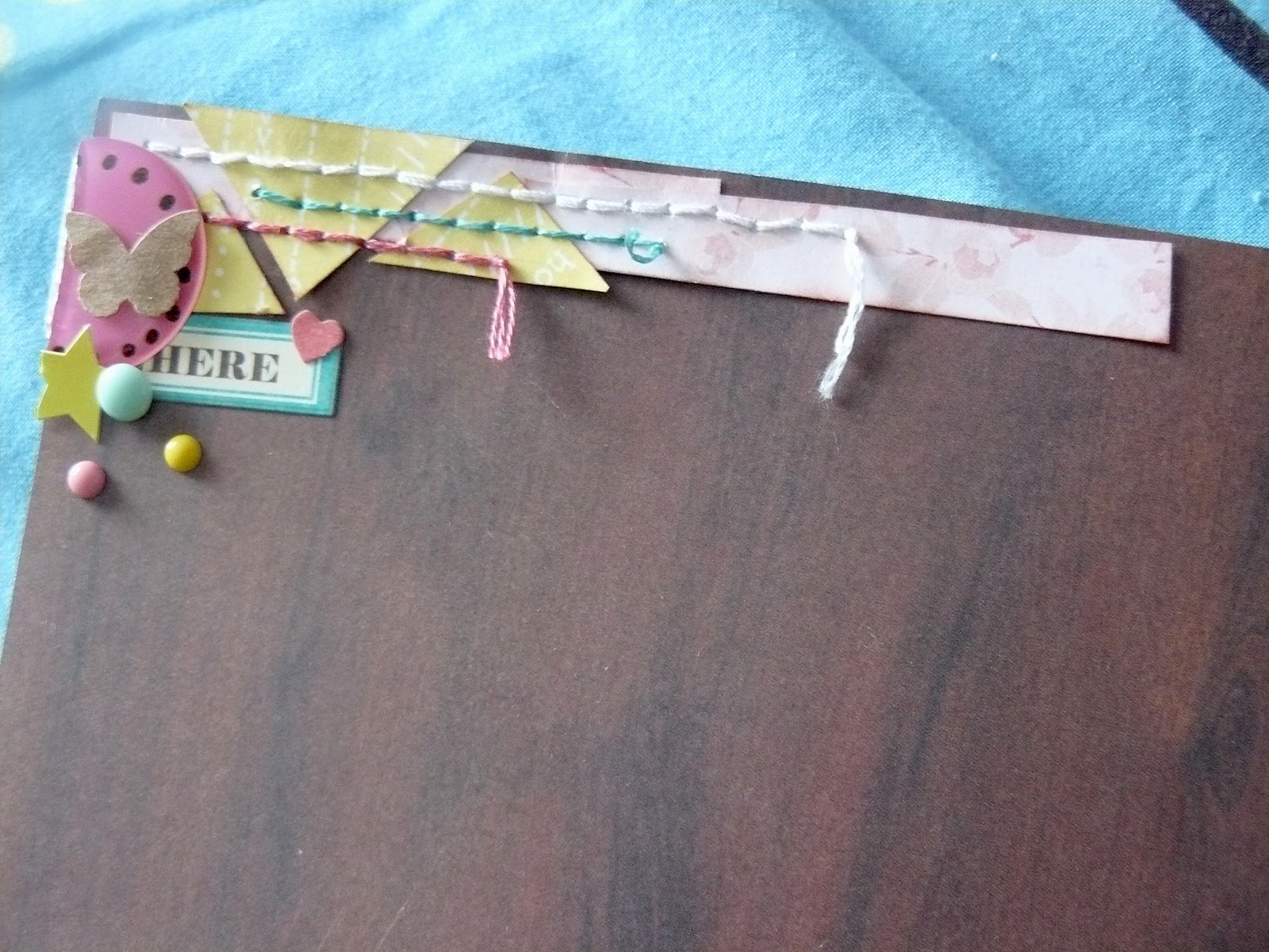 Time to scrap then! I wanted a bit more yellow on the layout, and really like the idea of arrow to make the design even more "central". I first tried with triangle wood veneers, yellow paint... and finally decided to cut them out of the same yellow paper i used for the border. Added some stitches (while watching The Middle, i'm a multitasker ;)). I had little yellow triangles from my first attempt, so i decided to use them on top of the layout. Added some more stitches, and a few bits and pieces.
I had the title in mind for a while, but could not find the perfect pink alpha for the title. Ended up discovering this purple one at the bottom of my stash (it's a very old Basic Grey alpha), then wrote the rest of the title with my wood veneer alpha (told you i'm obsessed.
And i decided to stop there. Lots of white space (not so white in this case) can be good sometimes.
Love it. Those wood veneer alphas look fantastic
ReplyDeleteBeautiful. I really like the look of those wood alphas over your photo!
ReplyDeleteThe cluster of details you put in the top, left corner are great!
ReplyDeleteGreat layout, love the big arrows pointing to the photo and the cluster of embellishments at the top :)
ReplyDeleteLove those letters and the cluster of embellies at the top!
ReplyDeletelove the light colors on the dark background
ReplyDeletepretty; love the stitched triangles :-)
ReplyDelete